

J. Abraham Consulting
J. Abraham Consulting is an Australian temporary works and engineering management consultancy led by Joe Abraham, whose experience spans rail, road and bridge projects. The practice needed a brand identity, document suite and website that could carry Joe’s credibility to the contractors and project teams he works with, and present the consultancy as an established partner on major infrastructure work.
Melbourne, VIC
Completed
2025
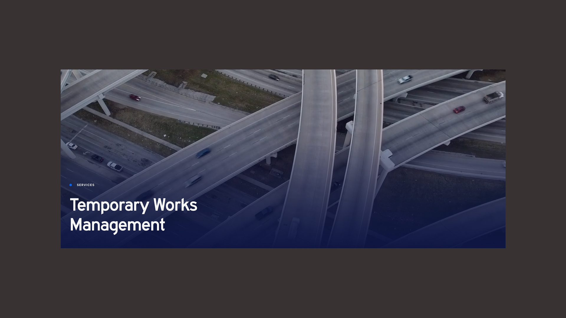
Temporary works are the propping, shoring and staging that make permanent infrastructure possible, and most of it is gone by the time a road or rail line opens. The people who manage this work are judged on whether anything went wrong, so the identity had to communicate reliability before it said anything else. We looked to the environments Joe’s clients work in every day for our references.
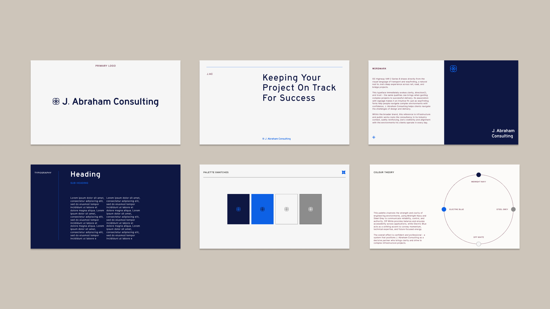
The wordmark is set in OC Highway VAR 2 Series 6, a typeface drawn from the lettering of road signage. Signage type is built to be read at speed by people who need to know where they’re going, which is close to what a contractor wants from a temporary works consultant. It places the consultancy inside its industry at first glance and gives the brand a familiarity that a more decorative typeface would have worked against.
The symbol is formed from four overlapping circles, with a simplified outline and a solid mark drawn from the same geometry for use at smaller scales. The four circles represent the functions the practice sits between: project, engineering, commercial and delivery management.
Midnight Navy and Steel Grey carry most of the system, chosen for the authority they hold in engineering settings, and Off White keeps layouts open and accessible. Electric Blue is used sparingly on the symbol, section markers and calls to action, which keeps a conservative palette feeling current.
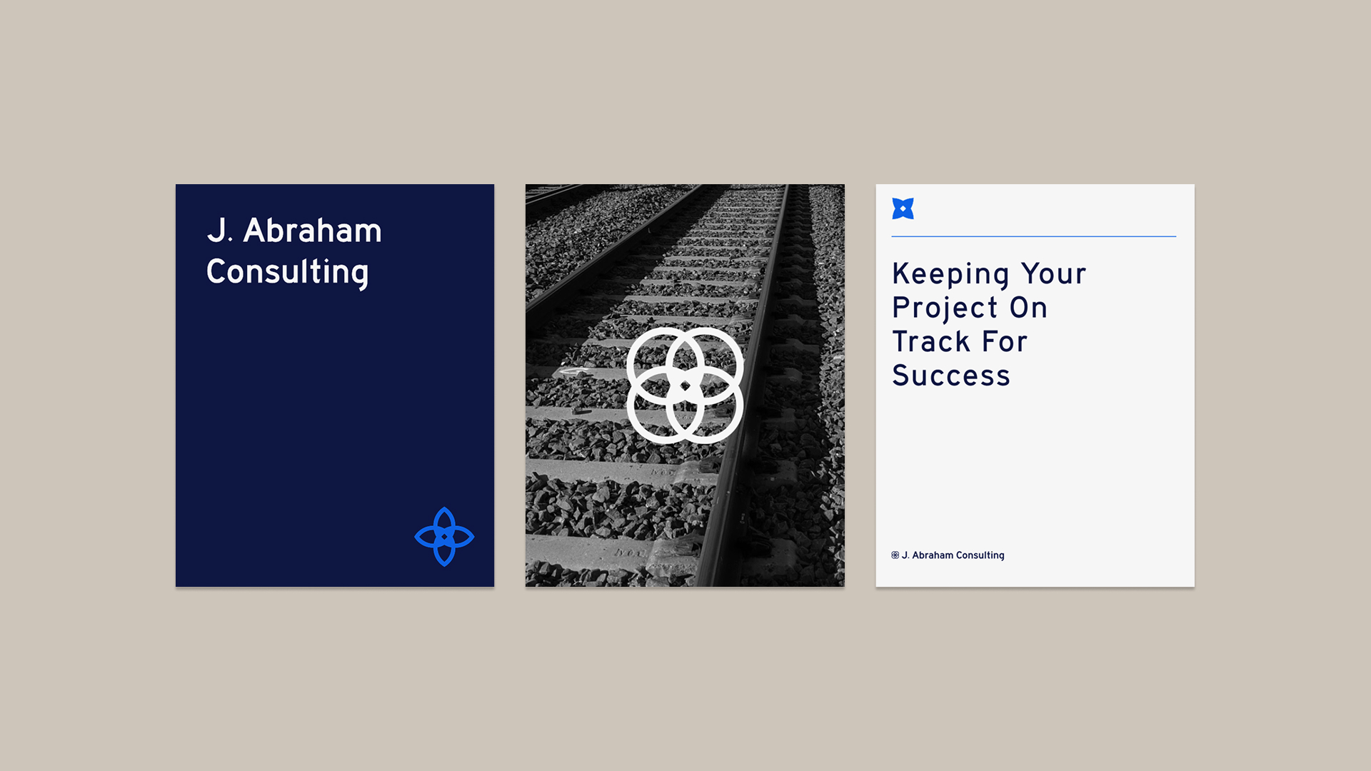
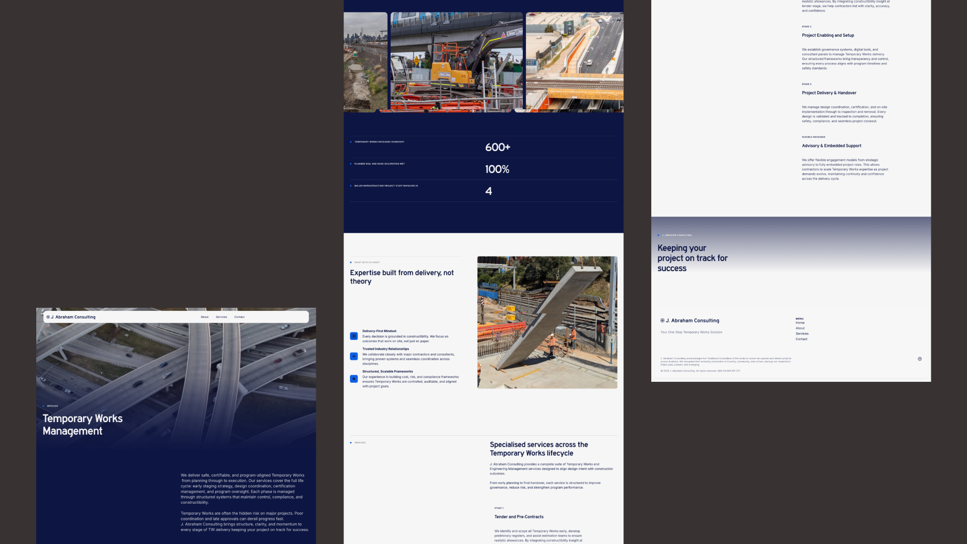
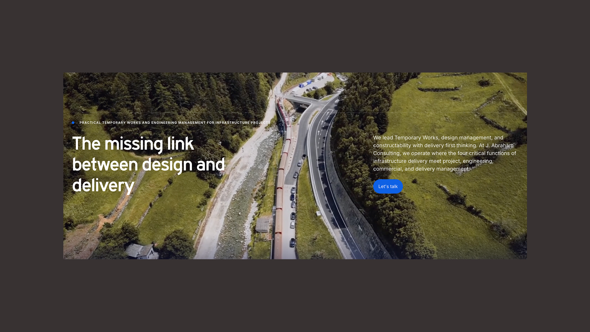
The document suite was designed for digital tender submissions and client reporting, where a consultancy is often assessed long before anyone meets in person. Covers carry the line “Keeping your project on track for success,” paired with rail imagery that makes the phrase literal. The website opens on a single positioning statement, the missing link between design and delivery, and its services are organised around the temporary works lifecycle from tender through to handover so a contractor can find the stage that applies to them. Project figures sit high on the homepage because in this industry a track record persuades faster than any description of approach.
J. Abraham Consulting now presents consistently wherever a contractor is likely to meet it, from a tender document to the homepage. The identity takes its authority from the infrastructure Joe works on, which suits a consultancy whose value is measured in projects that open on schedule.
Services: Brand Identity, Logo & Symbol Design, Document Design, Website Design

Thanks so much for your amazing work!! You are brilliant.


Lost In Landscape