How to Stretch a Brand Without Snapping It
May 1, 2026
On pattern, repeat, and the brands that knew when not to start over.
I spent years designing textiles. A pattern that works on a quilt cover has to work on a pillowcase, a cushion cover, a fitted sheet. The repeat has to hold. Design it right and someone picks up the pillowcase in a store and knows immediately it belongs with the quilt cover already in their trolley. That's not luck, it's a system.
Brand extension works the same way. Most businesses, when they feel their identity has outgrown itself, want to start over. New logo, new palette, new everything. Starting over feels like the answer, and occasionally it is, but more often than not it erases the one thing that took years to build: familiarity.
Familiarity is what makes someone recognise you mid-scroll. It's the reason a customer reaches for your product without hesitating. It builds slowly over years and once it's gone, you can't get it back. The idea is to keep what's working and build on it, so your audience comes with you rather than having to catch up.
Go-To Skincare is a good example of this. They've evolved their brand three times and each time managed to feel fresh and familiar. The hero font, the signature peach, the voice, all stayed intact while the packaging improved, legibility was fixed, and the details got sharper. If you'd been buying Go-To for five years, you never had to relearn who they were. You just watched them grow up.
Sheet Society took a different approach with the same thinking behind it. Rather than pushing their homeware brand into fashion, they built a sister brand instead. Resting lives alongside Sheet Society as its own entity, but the link is unmistakable: the colours, the patterns, the overall aesthetic. Your bedroom palette, now wearable. Two brands that feel like they were always meant to exist together, each reinforcing the other without competing.
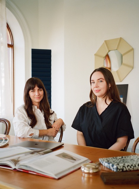
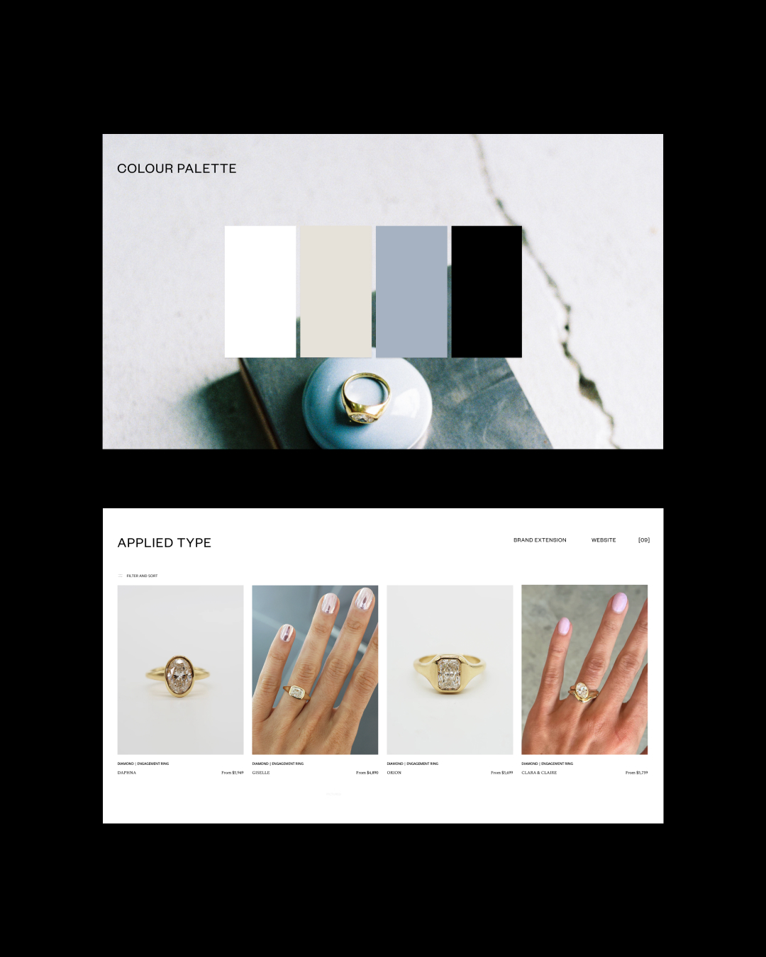
It's something that shaped my work with Melbourne jewellery designer Daphne Huguette. Her brand was already minimal and editorial, her physical touchpoints refined. My role was to extend her existing identity so her business could properly evolve into a website and broader digital presence, expanding the colour palette and building out a type system that could carry the brand across new contexts, without losing what made it distinctive.
The tension between evolution and consistency is one of the more interesting challenges in brand work. Move too far and you lose the recognition that took years to build. Move too little and the brand stagnates. The brands that hold together over time aren't always the ones with the most distinctive logo. They're the ones where someone cares about every decision, including the ones nobody notices.
That's the work I find most interesting.
— Miri