
BASSCARE
BASSCARE has been part of Melbourne's east for decades. Retirement living, respite care, dementia support, meals-on-wheels, activity groups across Boroondara, one of the city's most established communities. Following a brand strategy developed by Flaunt Marketing, the organisation was ready to bring its identity into alignment with its actual scale. The brief was to build something that could hold all of it.
Melbourne, VIC
Completed
2025
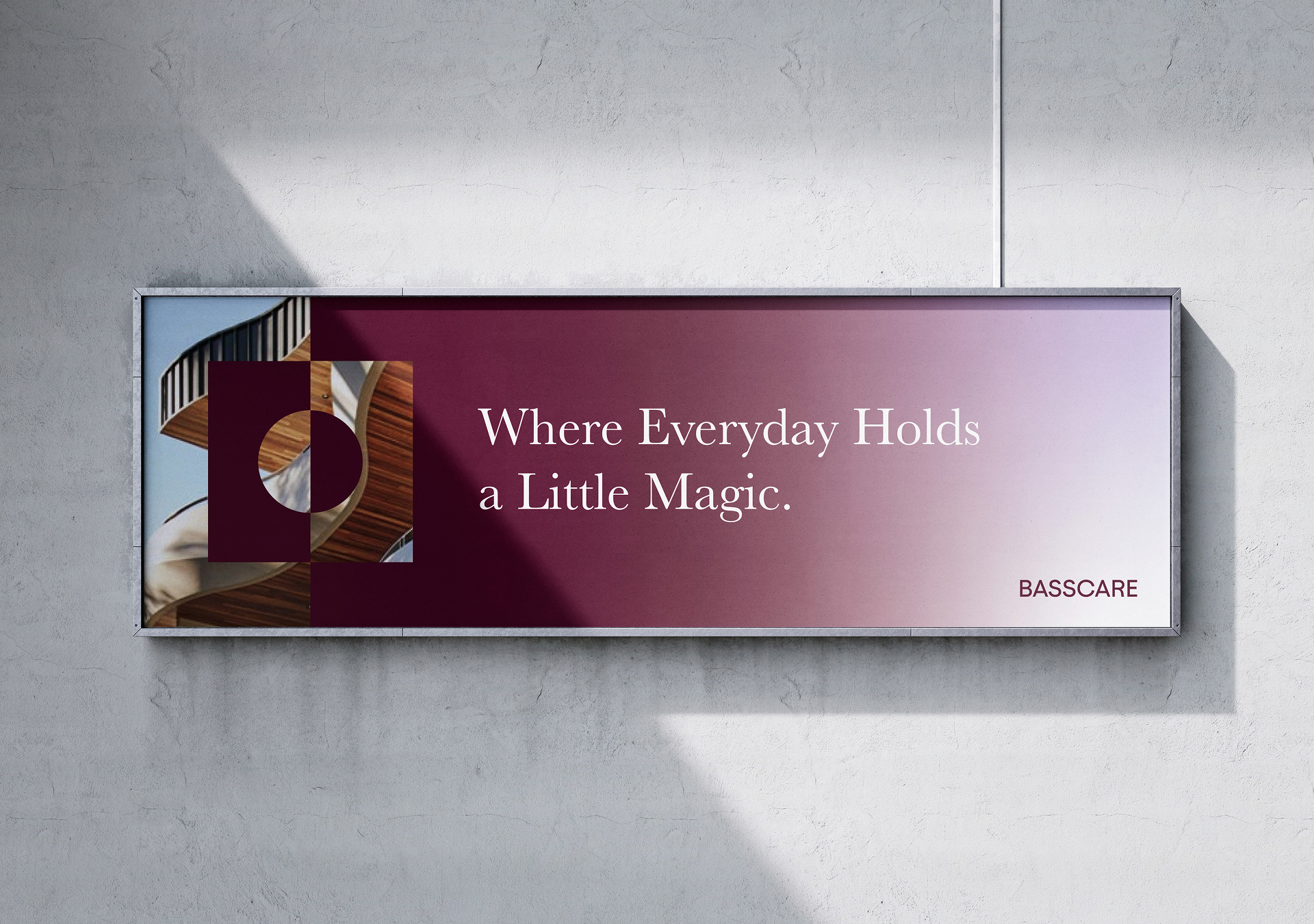
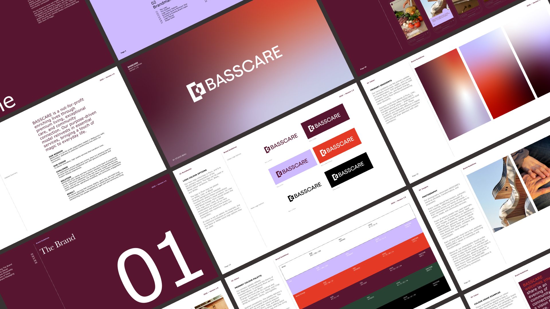
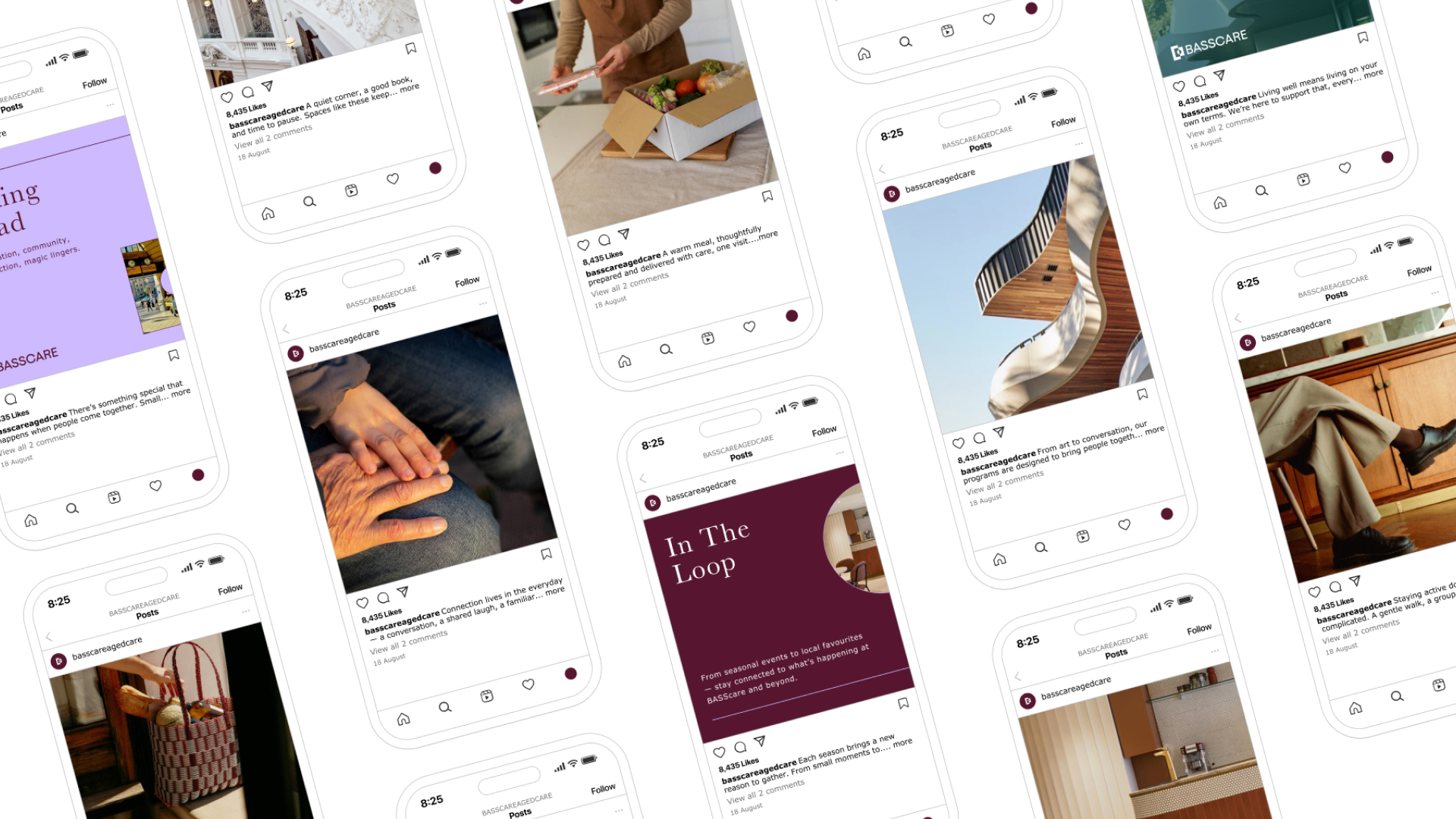
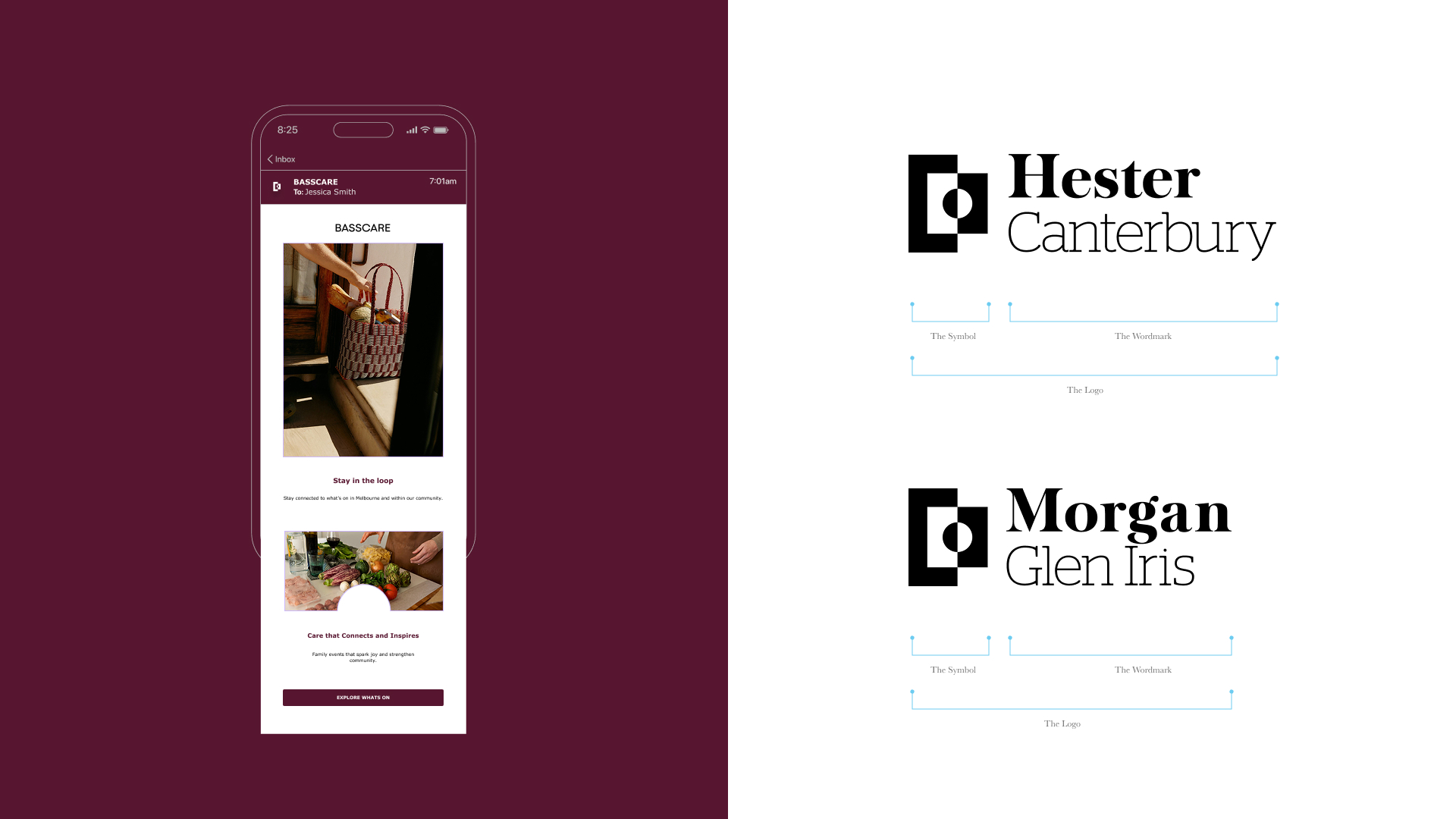
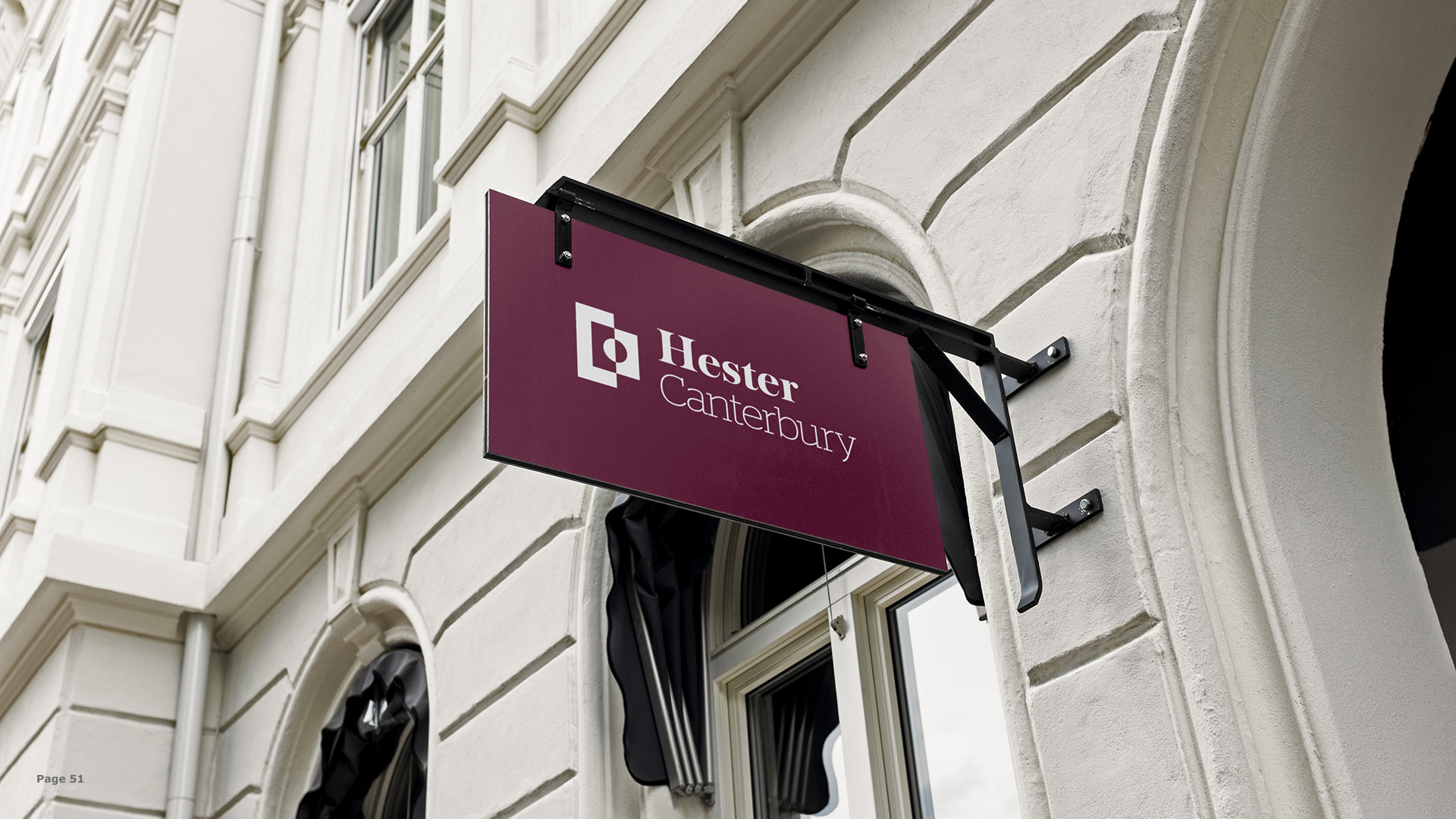
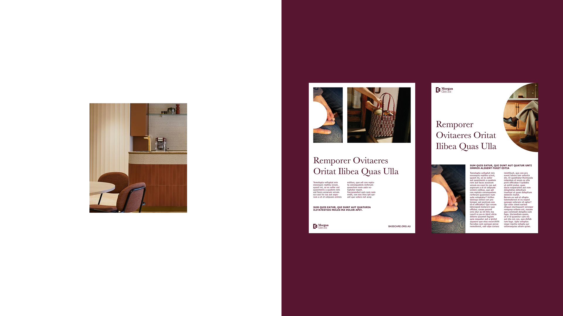
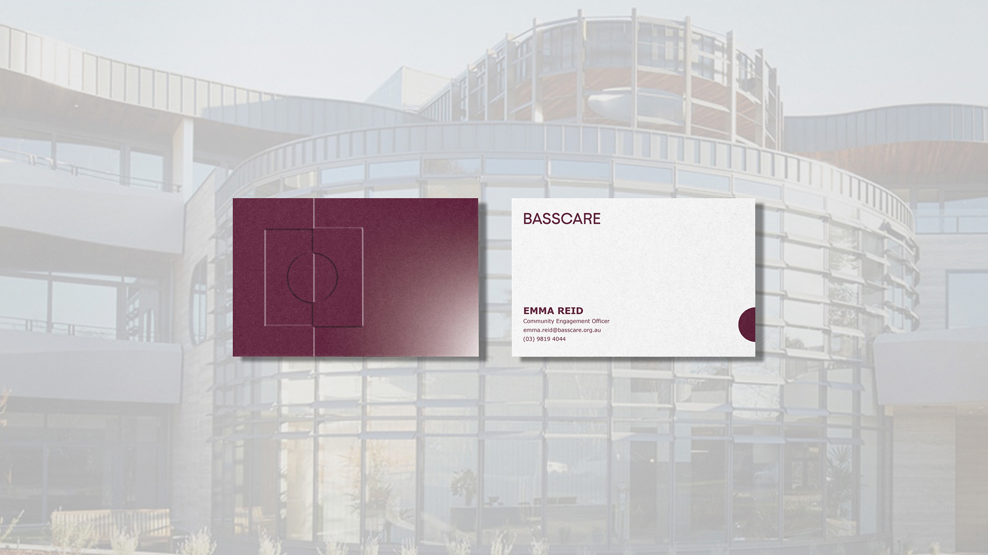
The identity began with the symbol. The concept, drawn from the idea that transformation begins in the space between, used geometry to construct a visual threshold. Intentional forms placed in deliberate relationship, where the negative space does the work. Inviting the viewer to look closer rather than announcing itself immediately. The mark was designed to sit alongside each of BASSCARE's service wordmarks across a portfolio of businesses, functioning as a unifying presence without overpowering the individual marks beneath it. The colour palette moved away from the primary-heavy conventions of aged care, grounding the system in Plum with Blood Orange and Vivid Lilac introducing contrast and energy, supported by Teal, Black, and Crisp White for balance and legibility. Typography was selected with the same dual logic, prioritising accessibility and readability for older audiences without sacrificing visual weight. The website followed the same thinking. Rather than defaulting to a service directory, it was built as an editorial content experience, a resource for anyone over 50 in Melbourne's east, with a clear information directory running alongside BASSCARE's full suite of services.
BASSCARE now has an identity that can scale with the organisation. The website gives them the infrastructure to build an audience, not only serve an existing one. The response from the community has been immediate, and internally the brand has shifted how the organisation presents and carries itself.
Brand Strategy: Sharyn Lowe — Flaunt Marketing

.avif)

Daphne Huguette